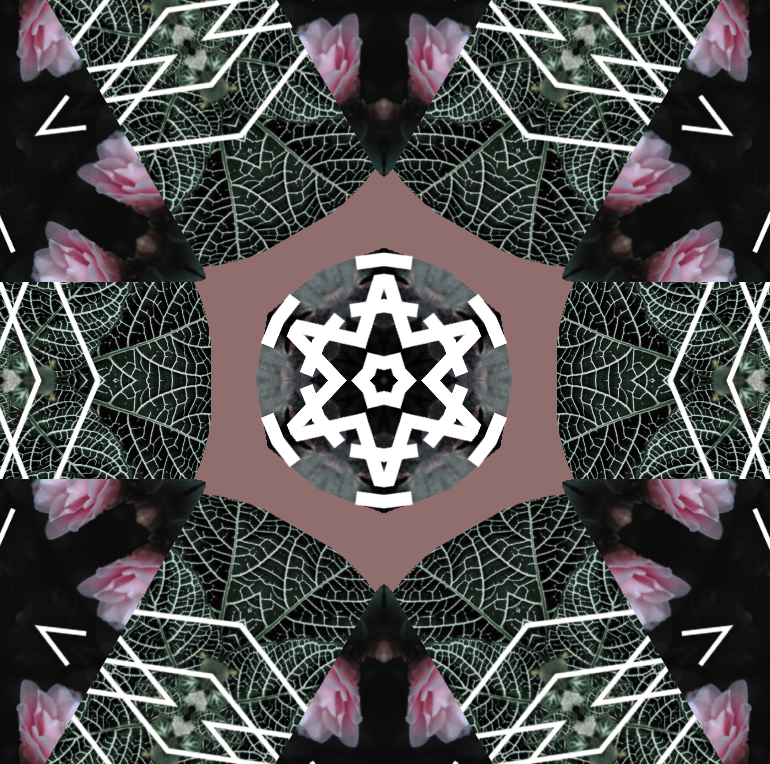
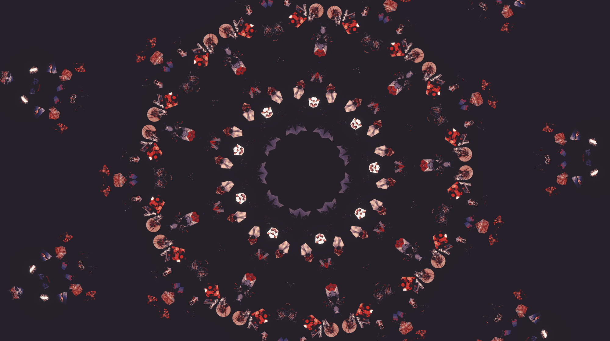
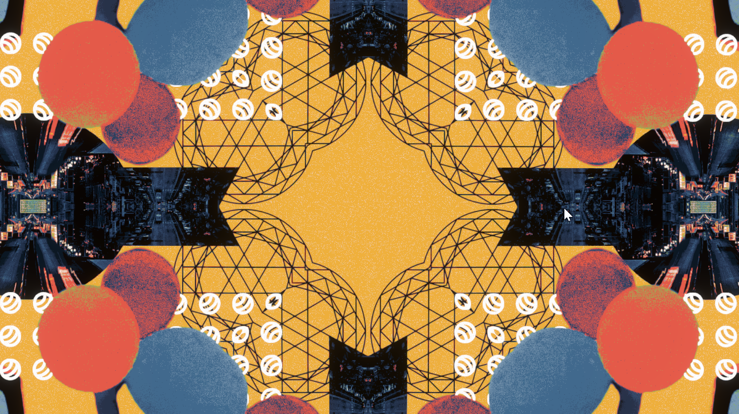
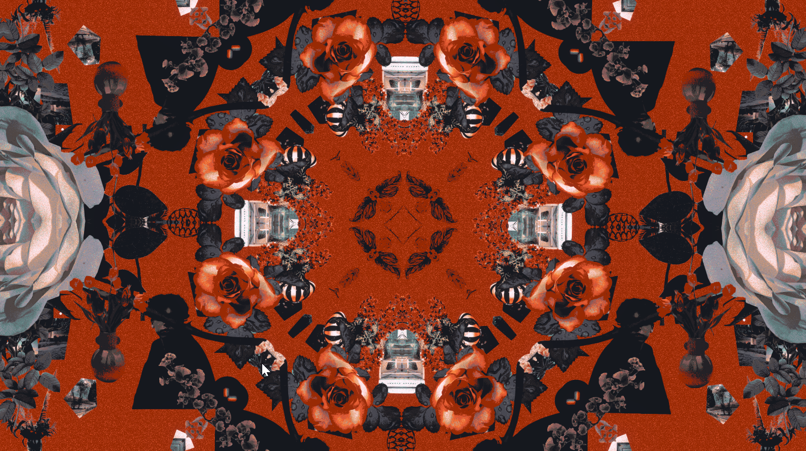
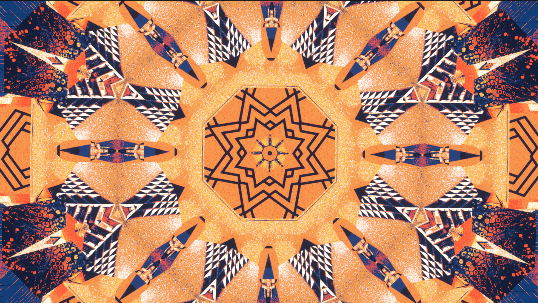
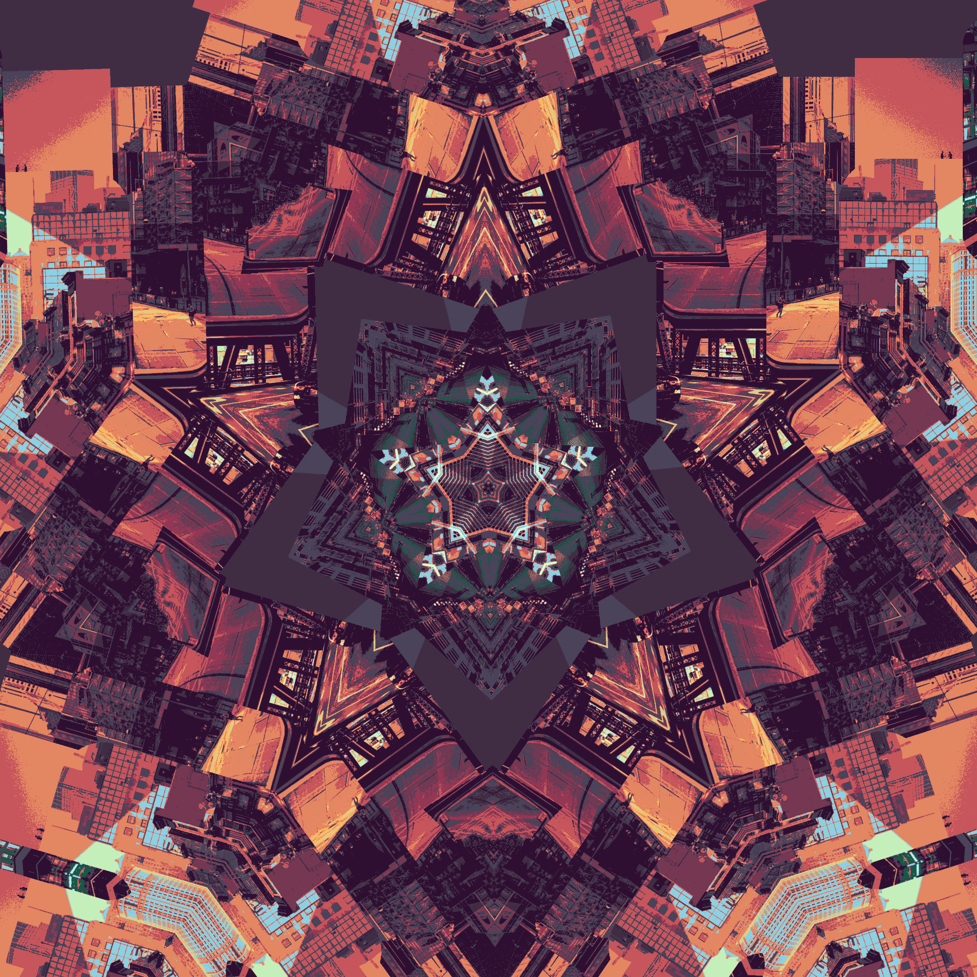
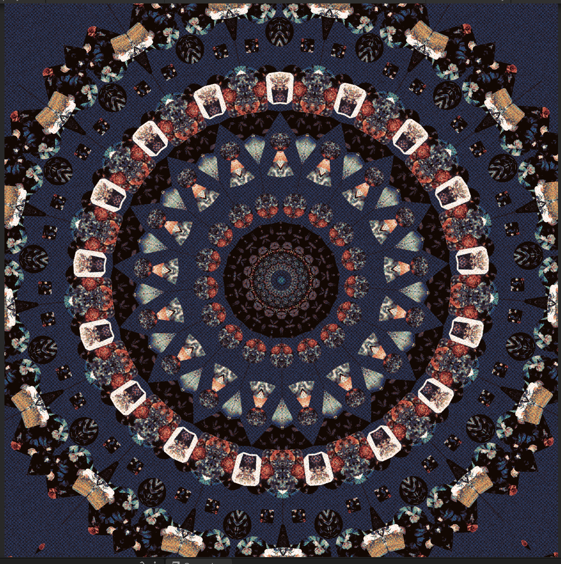
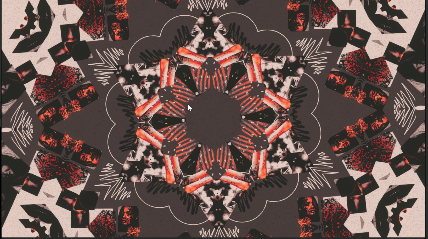
I've been thinking how the spacing between elements, size of them, colors and such affect the visuals. I'm quite happy with the plan I have now, of having different types of rooms, each of which will have different styles. This creates visual variation and makes the game look interesting.
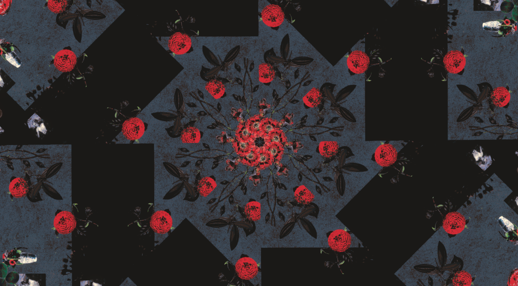
For kaleidoscopes, the effect depends on having different textures and colors, and having variation. I want to make the kaleidoscopes not only look nice, I want it to be really hard to end up with an ugly-looking, boring or repetitive scene. Having an uniform color palette helps in this, as would post-processing the colors also.